


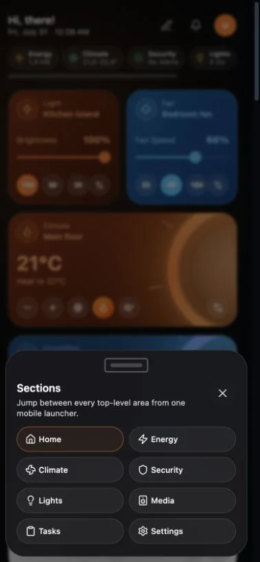
Navet keeps the same rooms, sections, and cards across screen sizes, but moves navigation into touch-friendly sheets on smaller screens.
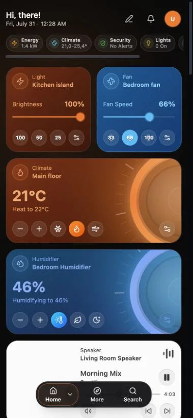
Move between sections
- Use the Home control to return to the Home overview.
- Open the section menu to choose Energy, Climate, Security, Lights, Media, Household, or Settings.
- Recently used sections remain easy to reach.
Choose a room
Open the room selector in the header, then choose a room or All rooms. Room groups can be expanded when your home has a deeper structure.
Search
Use the header search action to find visible devices and dashboard content. If a search result is not available, check whether the entity is hidden or belongs to a provider that is not selected.
Open card controls
- Tap the card’s main area to use the configured interaction style.
- Use the settings or details action for secondary controls.
- Dialogs become sheets where that gives touch controls more room.
- Avoid browser zoom while dragging or resizing cards in edit mode.
Use a tablet as a household display
For a dedicated tablet, use the Wall display preset instead of changing every related setting individually. It enables kiosk mode, keep-awake, a clock header, denser spacing, and the Home summary bar.
See Set up kiosk and Wall Display mode.
If controls feel too dense
Open Settings → Appearance and change Space usage to Default. More-space mode fits more content but can produce smaller touch targets.